
FREELANCE WEB & MOBILE REDESIGN
Breathing new life to a car detailing business, expanding its brand design and designing new web and mobile experience
TLDR;
Project Highlights and Fundamentals
How can we revitalize Dawson’s Detailing, an established car detailing business, by strengthening their brand and online presence, making it easier for current and potential customers to book and browse services?
My Personal Role
UX/UI Designer
Skills Incorporated
Branding, Design Thinking, Wireframing, Prototyping, User Testing
Timeline of Project
1 year
Deliverables
Figma Prototypes
Outcome
Does this story have a happy ending? Okay fine! I’ll spoil it! Look below or click around and see for yourself: https://www.dawsonsdetailing.com/
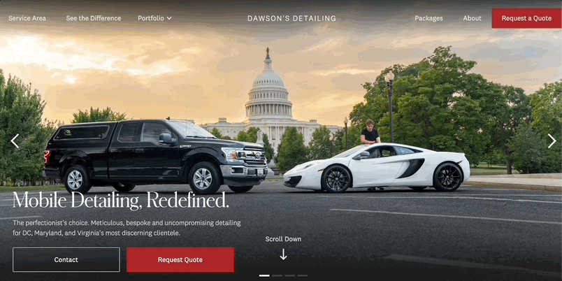
Before

After
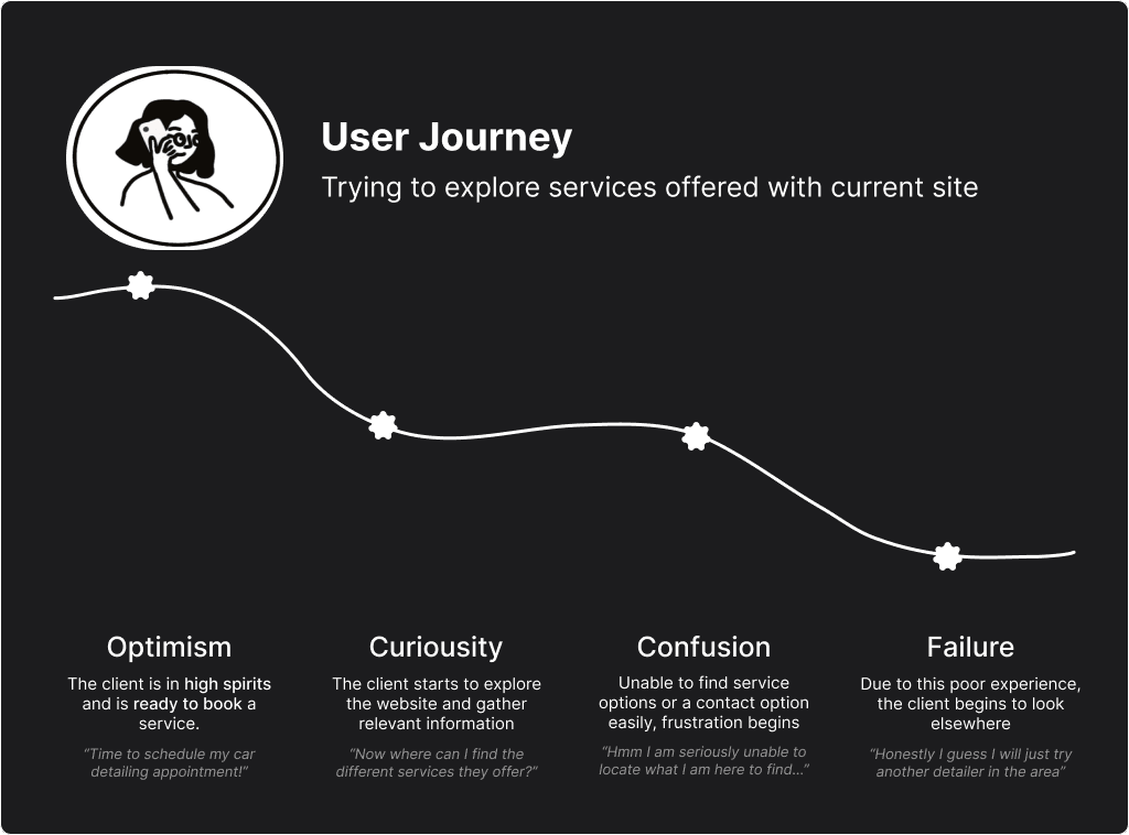
UNDERSTAND
Current Pain Points
What are we currently working with?
At the start of the project, I analyzed the existing site and talked with my client, James Dawson, who this entire project was made in collaboration with, about his wants for this project. During this process, I very much placed myself in the shoes of the user. What confused me as I navigated the site? What actions left me confused? As someone who has never gotten their car detailed, how much am I able to still understand?
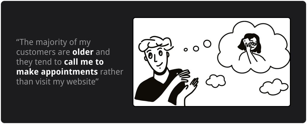
In addition to just my current understanding of the experience, I spent time understanding the behavior of current customers while talking to my client.
When consulting with the client, I learned:
The site evaluation, my specific questions, and talking to my client exposed a number of weak points that I was eager to address.
When evaluating the current site, I came across 3 main pain points:
1
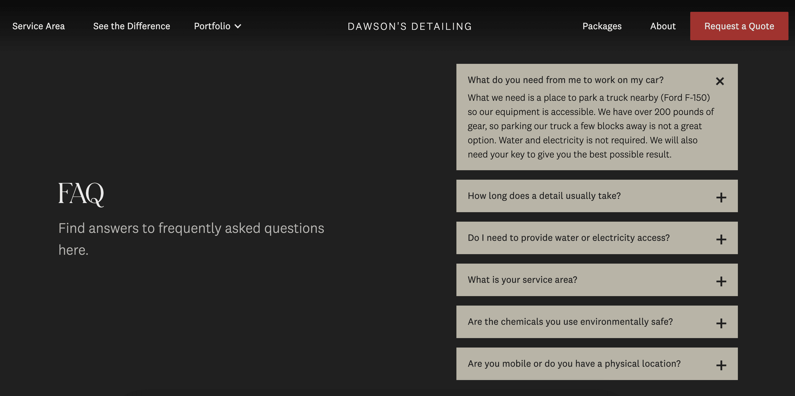
Navigation (what services are being offered and for how much $?)
2
Lack of solid brand identity (why should I choose this business?)
3
Contact information is hidden (how can I easily book?)
IDEATE
Generating Solutions
After considering common pain points, empathizing with a potential user, and developing strategies to address them, my solution centered heavily on the following:
1
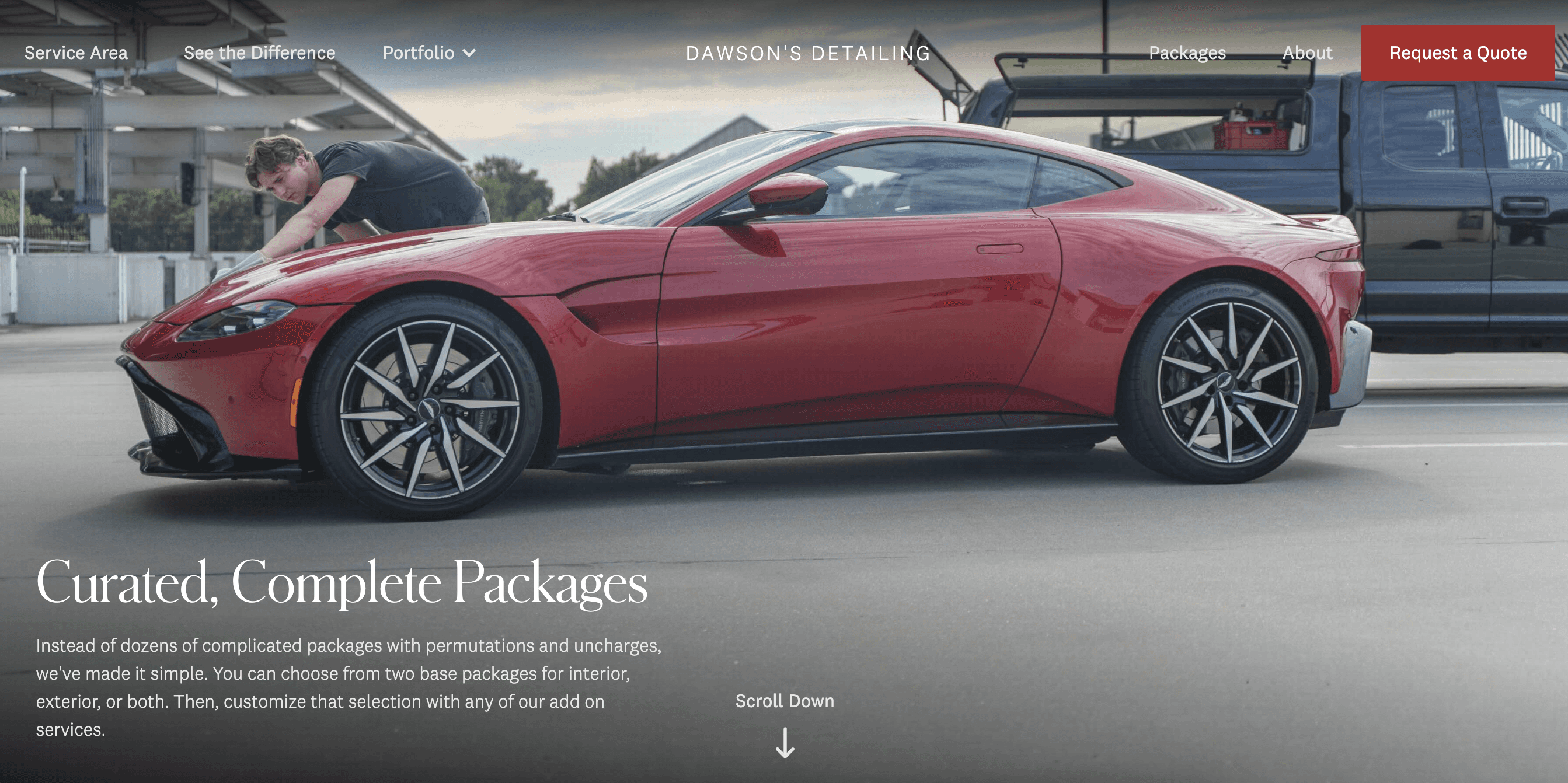
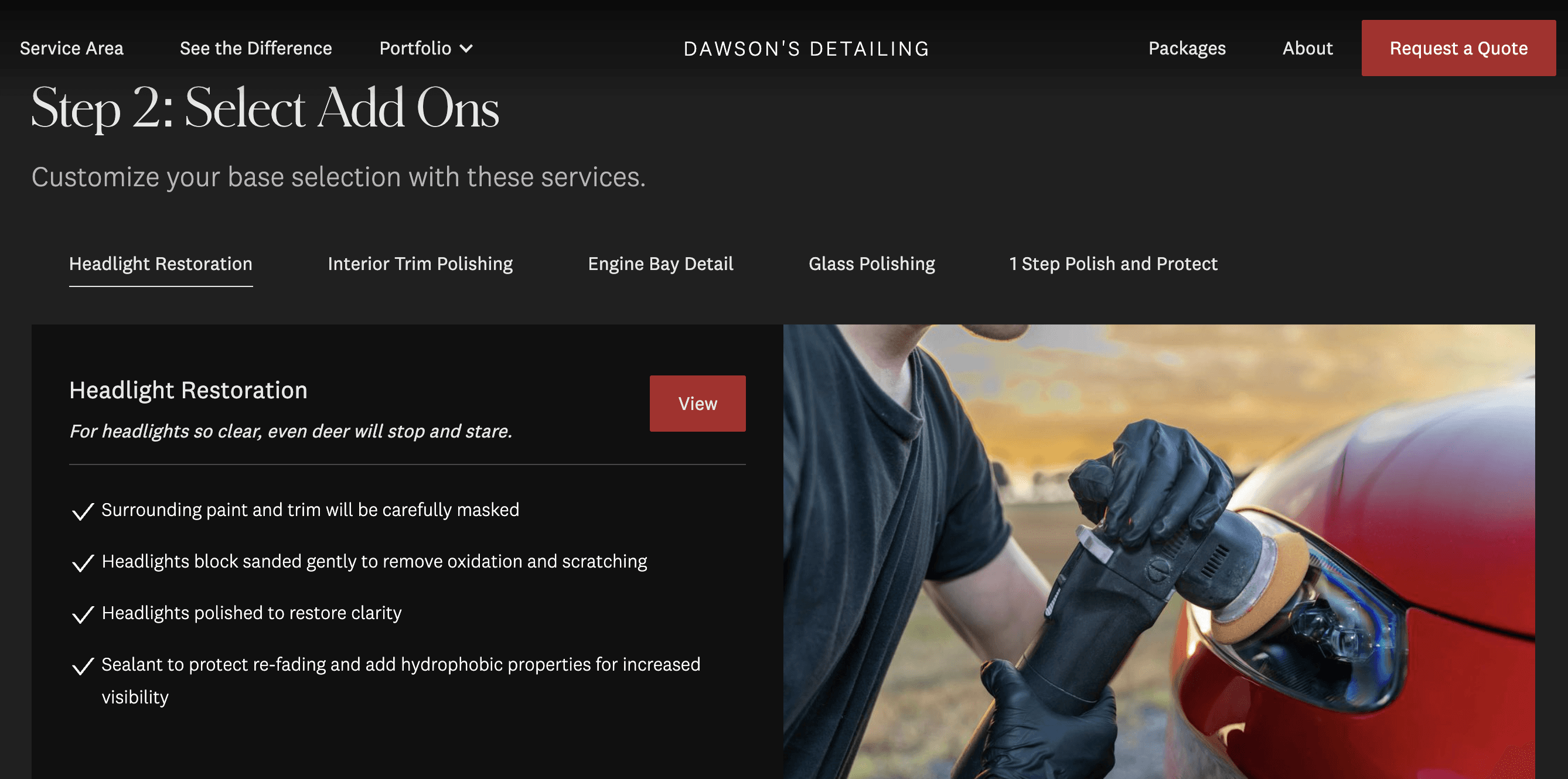
Layout and brand the various and different packages you can purchase
2
Refine brand by finalizing core values and expand color palette for more visual interest
3
Add Contact CTA on front page hero section
IDEATE
Moodboard & Branding
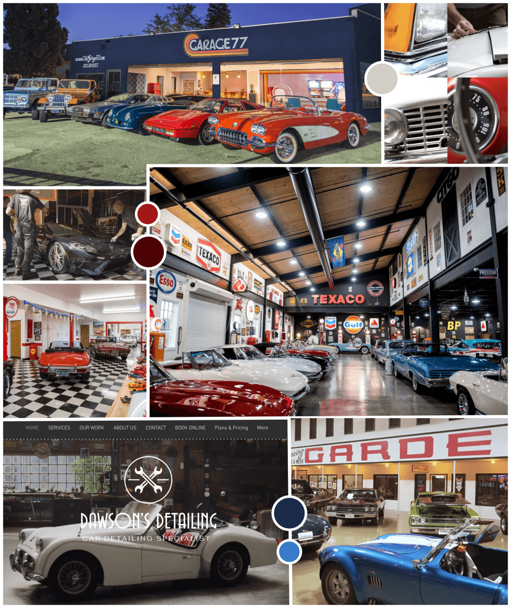
One of my favorite parts of this project was ideating the branding. Creating this mood board was only the beginning of defining the brand. We were heavily inspired by vintage car shop and garages from the 50s & 60s due to the values their brands carried (see below) . We chose to build off the existing red color of the brand.
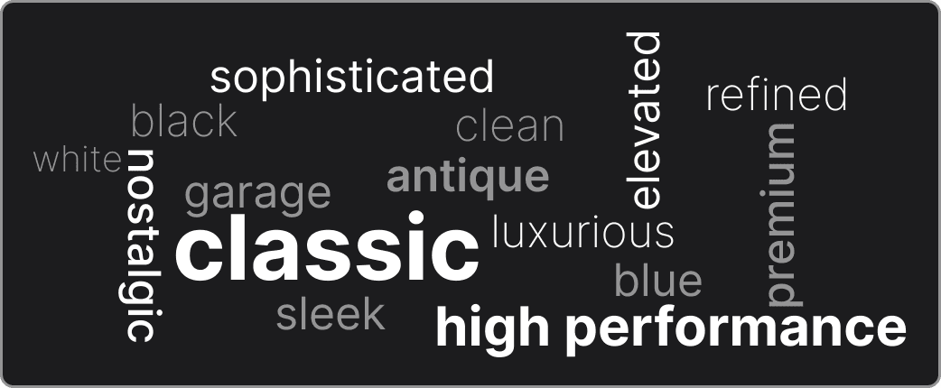
As a brand that offers high quality work it was essential that these values came through in the design. Creating a word cloud allowed me to center on these characteristics throughout my design process.
IDEATE
Cohesive Style Guide
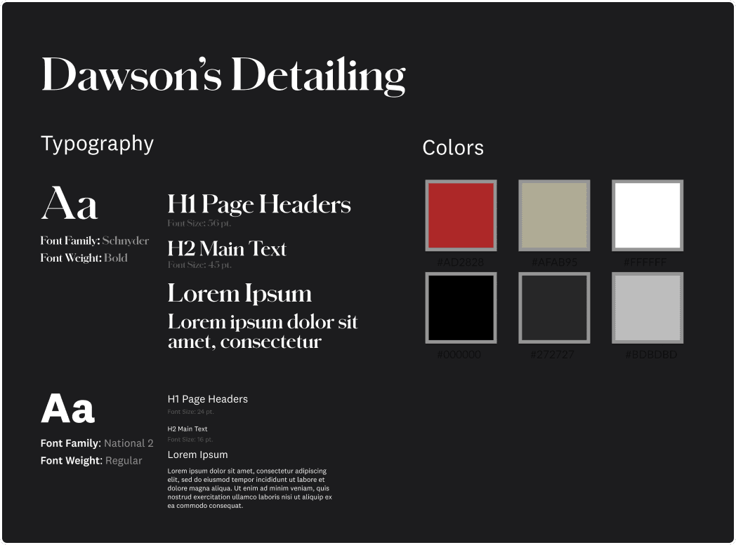
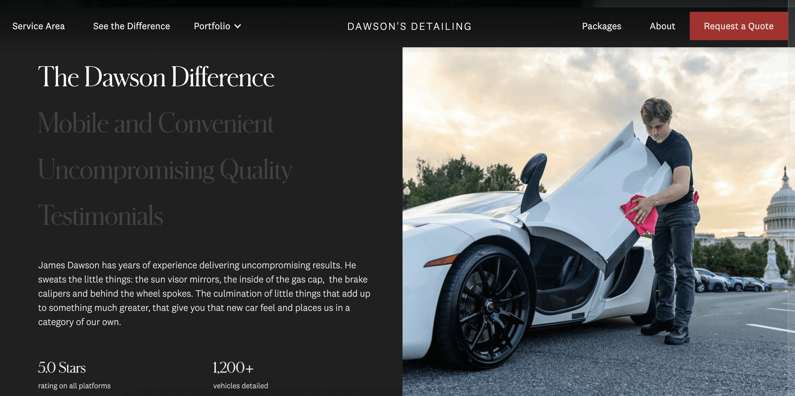
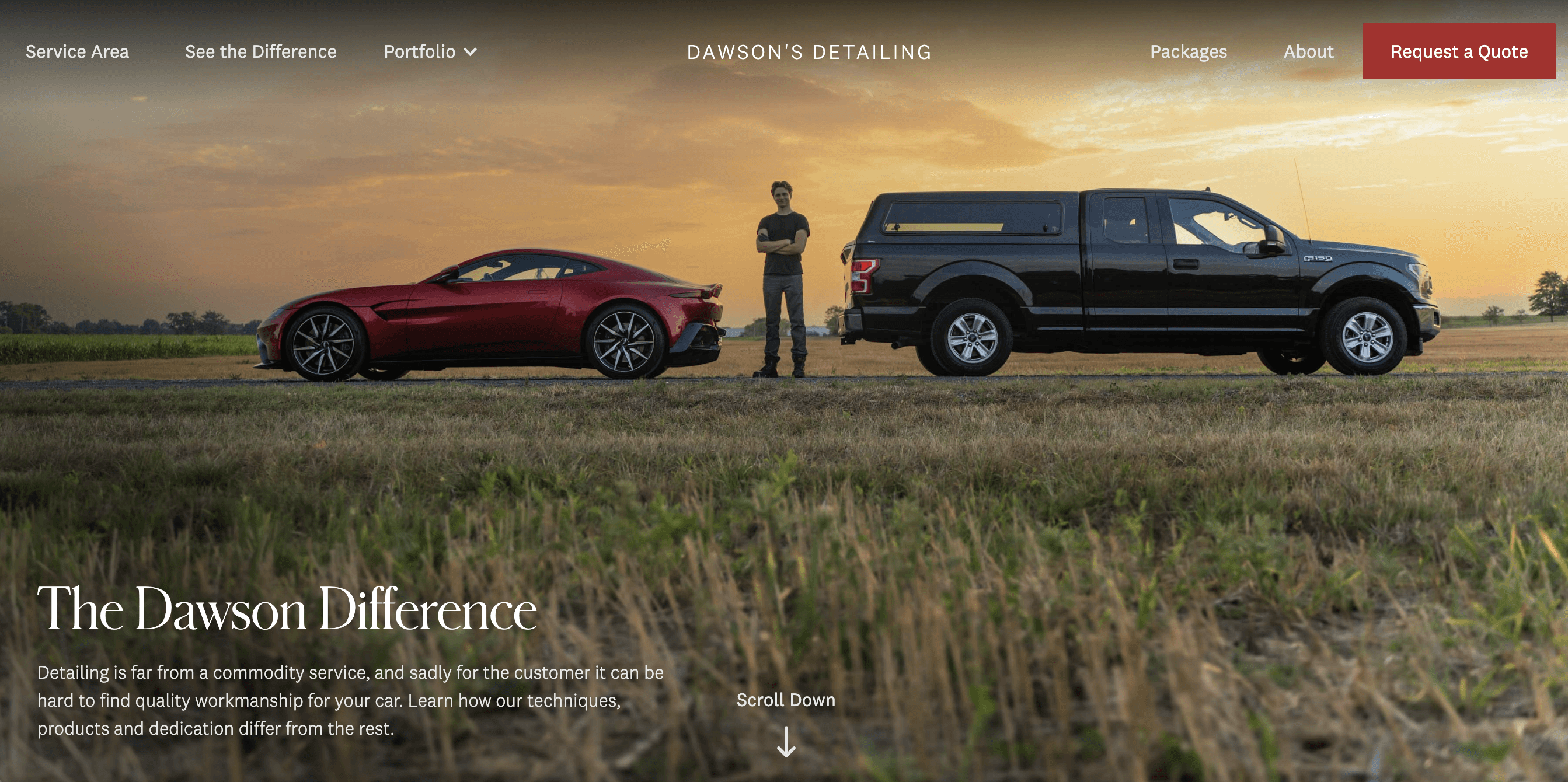
Brand is the story and design is the storytelling. We wanted Dawson’s Detailing to embody a sleek and luxurious look, emulating how one would feel after they had their detailing service done. We wanted it to feel like the equivalent of a luxury car brand. We played with color theory and typography to achieve this and create a cohesive and sleek visual identity.
DESIGN
Low Fidelity Mockups
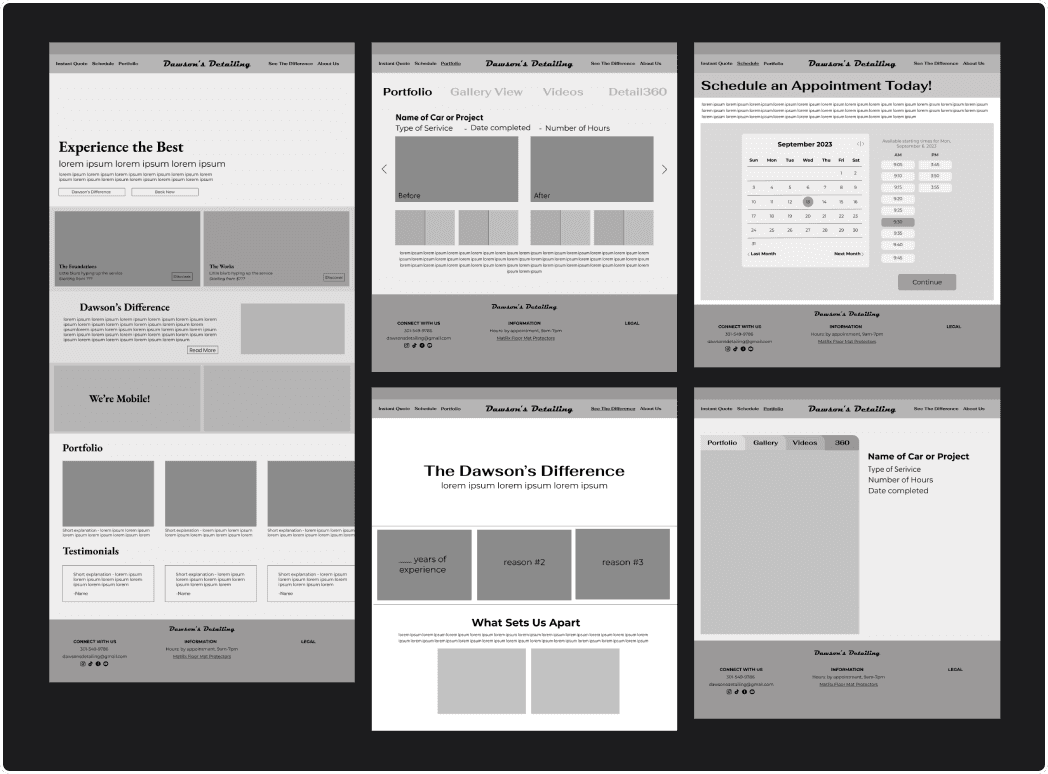
Making sure what Dawson’s Detailing can offer was a large priority. I wanted to make sure that even someone who wasn’t an existing detailing customer could fully understand their work and be enticed to make an appointment or learn more. The early stages of design focused on solidifying key features such as a portfolio space to showcase previous projects, a scheduling portal, testimonials, packages information, and key traits of the business and the owner himself.
DESIGN
Mid Fidelity Mockups
As we moved into mid fidelity mockups, responsive design became a major facet and included translating the designs into various breakpoint frames. From an accessibility perspective, headings were crucial to convey clear meanings of sections as well as assist with navigation.
DESIGN
Refinement Through Development
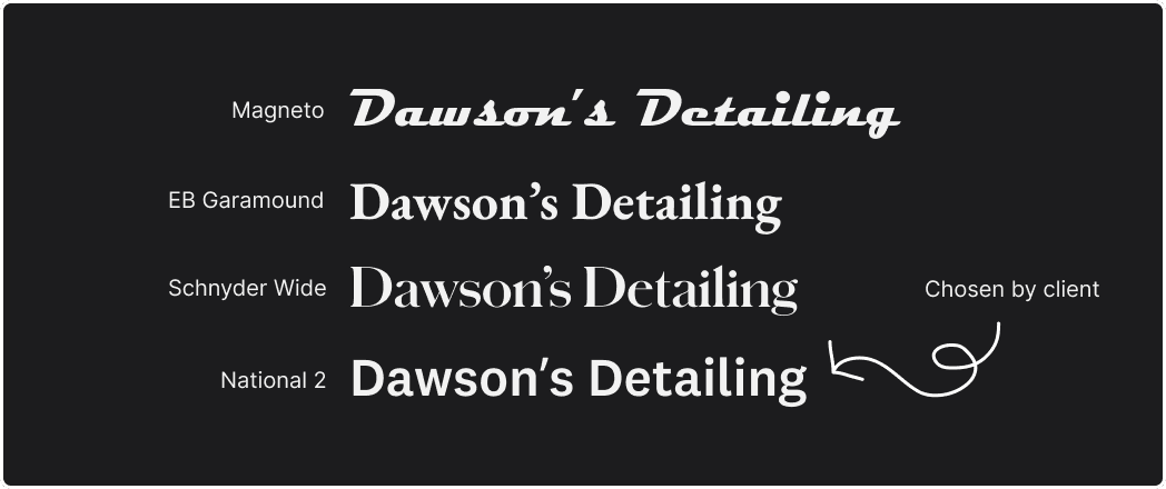
From Figma to Webflow - the site grew into itself, expanding through animation and scroll effects. At this part in the process is where the designs started to include changes as they moved to live product, balancing the wants of my client with the original design. One of the largest changes came in the form of the font of the main brand “Dawson’s Detailing” featured on the navigation bar.
As we moved to higher fidelities, my client and I conducted user testing on a few potential users. Some users were familiar with detailing and others were unaware. We wanted to learn about their current experience, understanding, and impression of the product. This allowed us to gather feedback that we could implement before launch. The main conclusions we came to after this include:
1
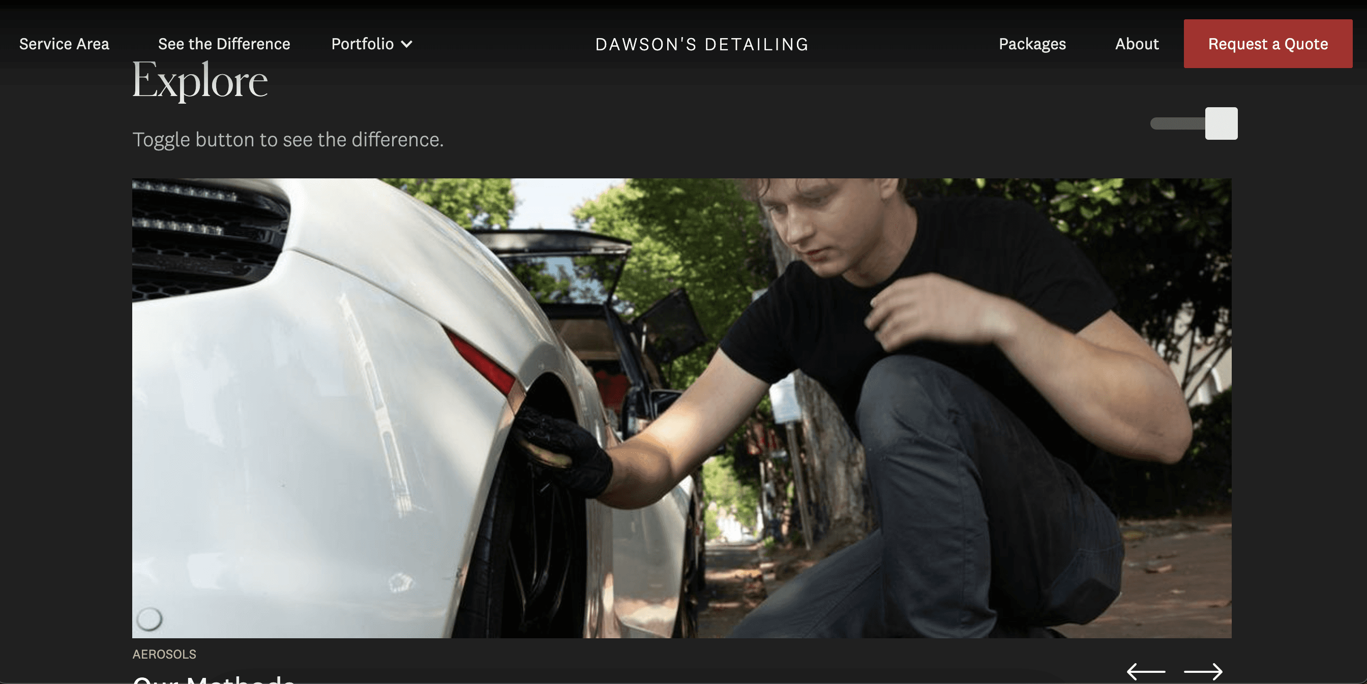
Users comment heavily on the photos and cars displayed in the images (emphasizing a potential avenue to keep users engaged and interested)
2
Confusing CTAs on multiple pages/unsure how to toggle
DESIGN
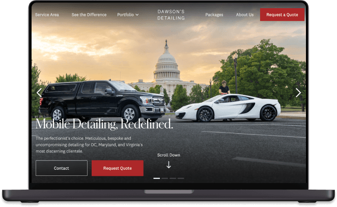
Final Live Product
The following pages reflect my contribution to this website in terms of design. The entire project was made in collaboration with my client, James Dawson.
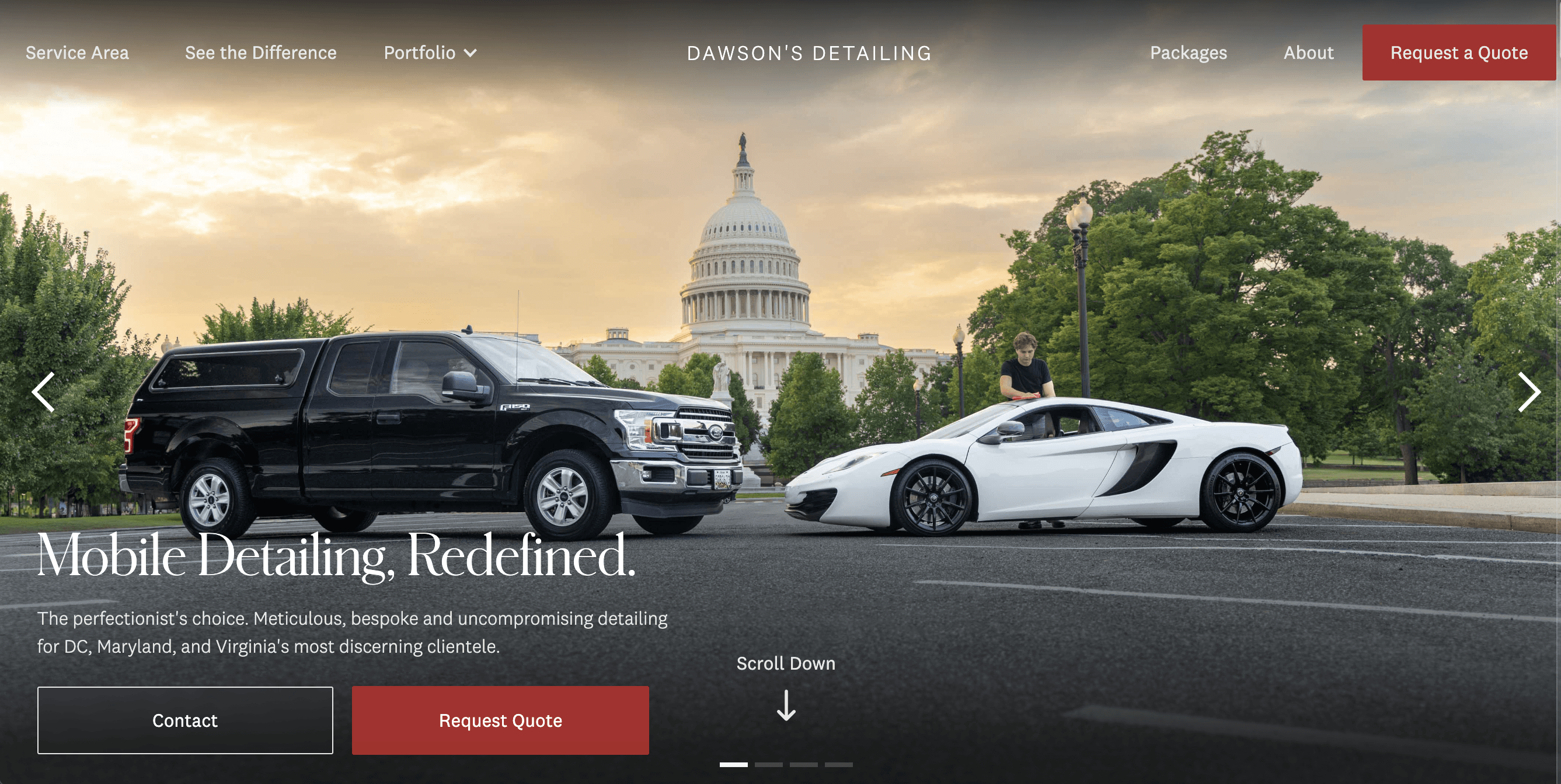
Home Page
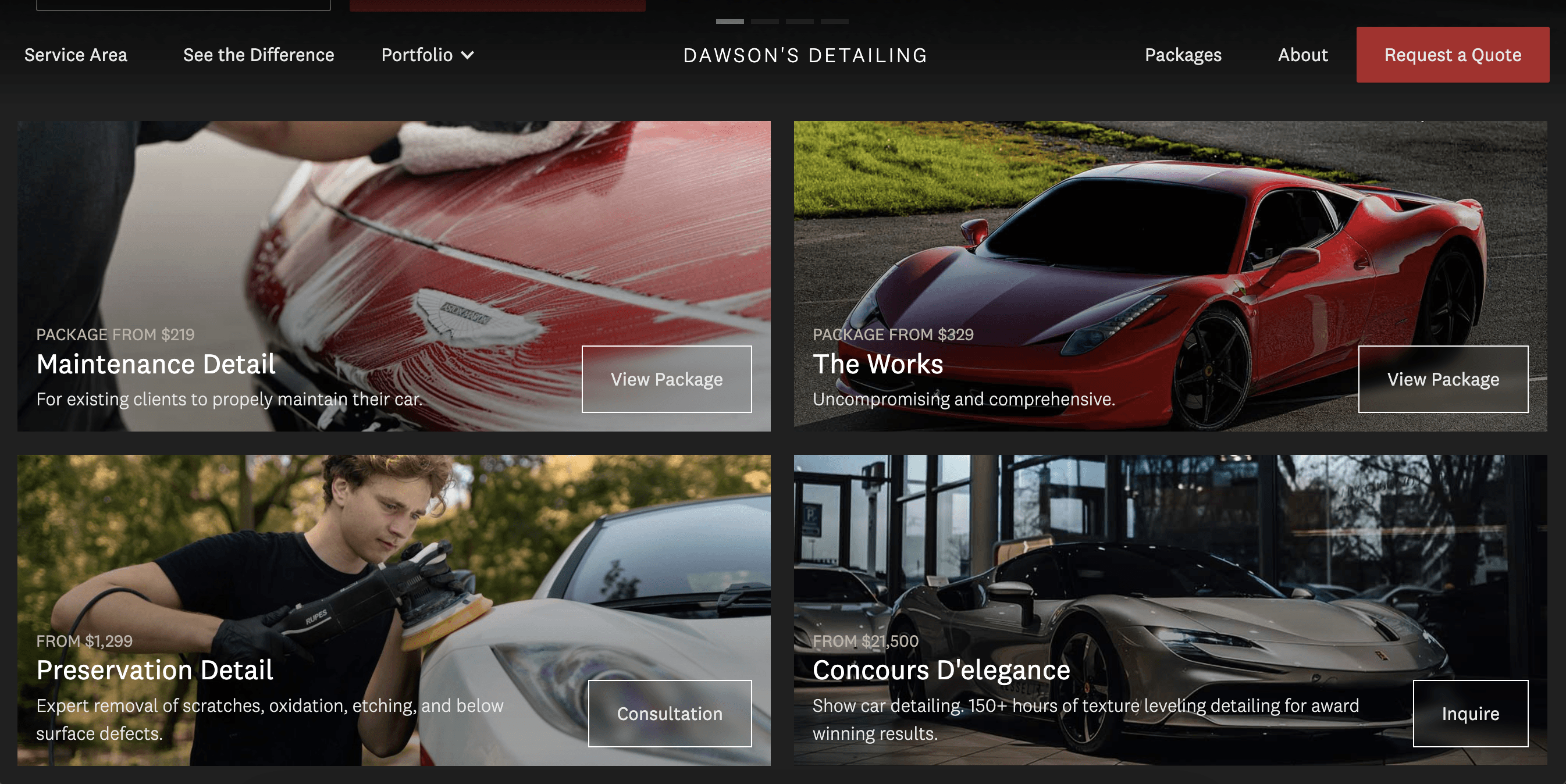
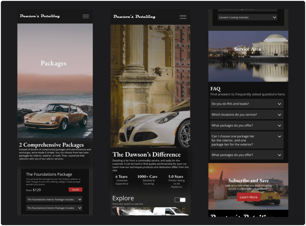
Packages

Dawson’s Difference Page

REFLECT
Metrics & Thoughts Post Project
30 days post launch, traffic was boosted by 773%, from 409 to 3,572 visitors!
This was a unique project for me, interacting with a client and balancing real-life business needs. All of this has taught me how important it is to understand your client’s wants and their brand. These both may be evolving so having frequent meetings, making multiple versions of mockups, and asking questions can all help to make the process easier. This project allowed me to work on clean design techniques like developing a design system, responsive design, and writing content for SEO.